Case Study: IBM COst of a data breach

Turning a yearly report into a trusted, business-critical experience.

Overview

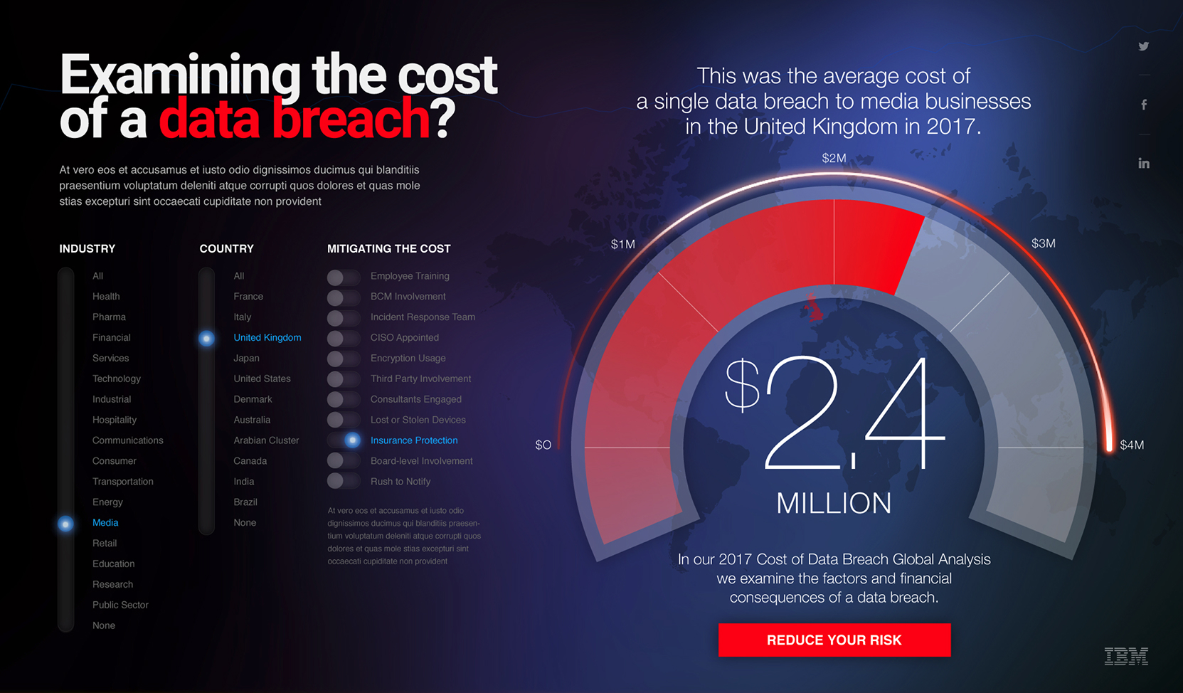
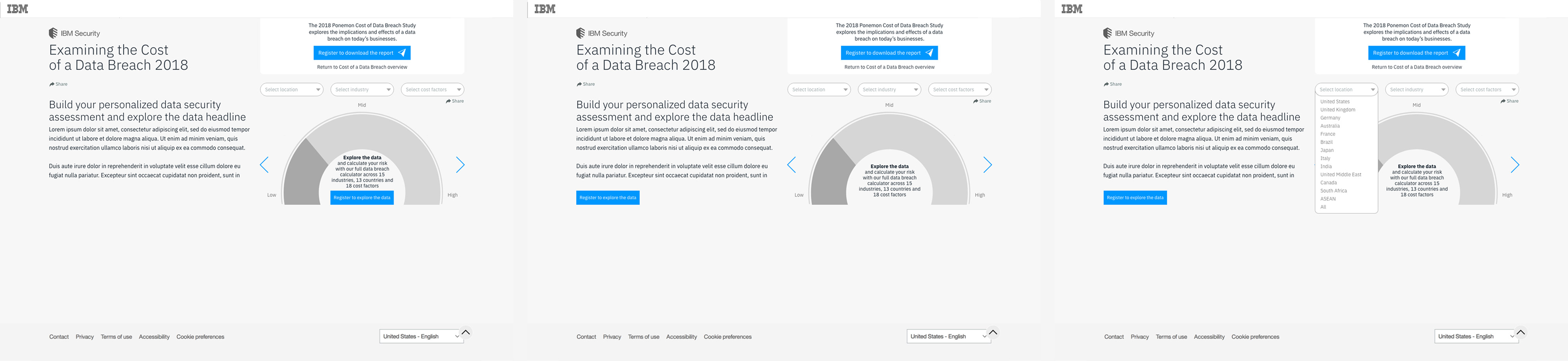
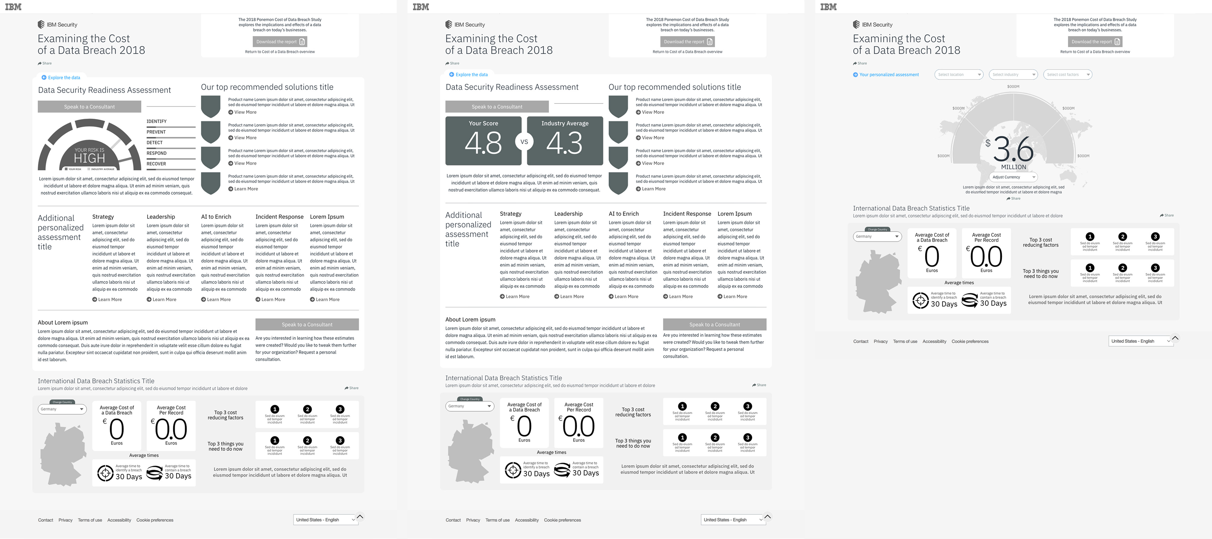
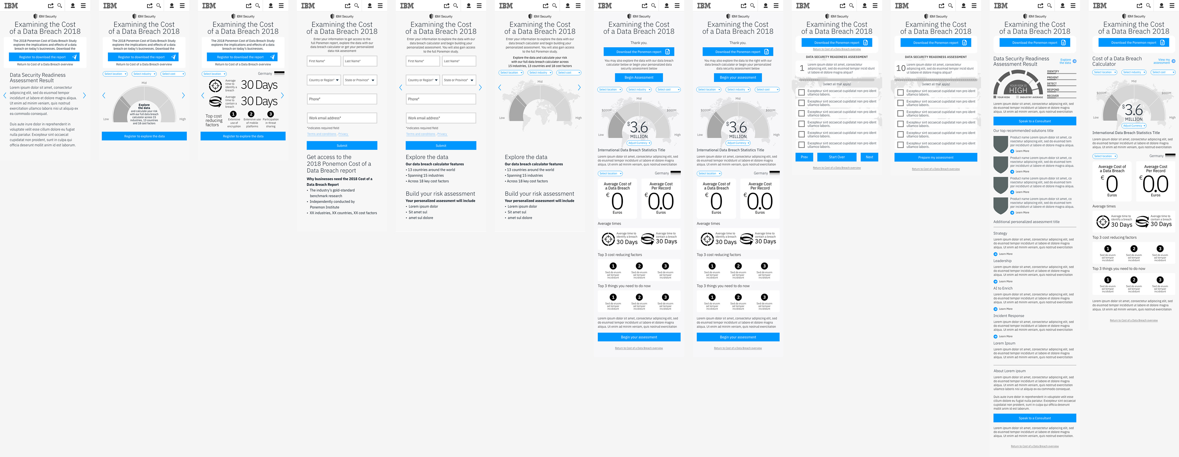
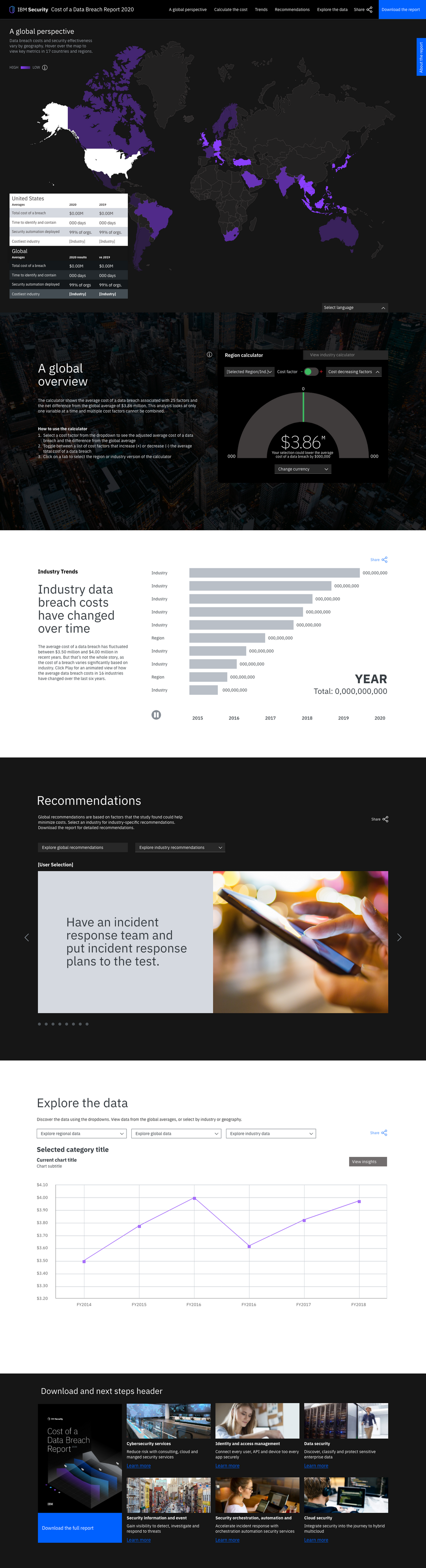
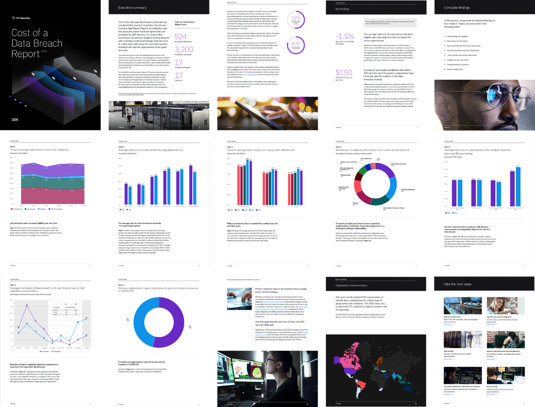
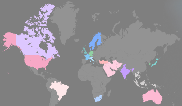
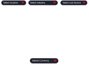
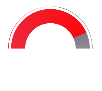
From 2017 to 2020, I led creative campaign development for IBM Security’s flagship research asset: the annual Cost of a Data Breach report, produced in partnership with the Ponemon Institute. In 2016, the campaign was mostly a report and press release. By 2020, it had become a data-driven, interactive benchmark for the entire cybersecurity industry.

Over the course of four years, the campaign evolved from a traditional PDF release into a dynamic, interactive experience, and ultimately became a cornerstone of IBM Security’s annual communications strategy.

The opportunity

Our goal was to transform IBM Security’s annual Cost of a Data Breach report from a static PDF into a dynamic, engaging, and scalable experience. We saw an opportunity to elevate the report beyond its traditional format, creating an asset that could drive leads, reinforce IBM’s thought leadership, and deliver real value to enterprise buyers through interactive data and storytelling.

Our team saw this as an opportunity to:

  • Increase global media coverage
  • Generate qualified leads
  • Improve engagement with enterprise decision-makers
  • Create meaningful differentiation in a crowded cybersecurity market

My role

Over four years, I served as creative lead and UX strategist, collaborating across IBM’s security, marketing, and product teams. I was responsible for:

  • Creative direction and design execution
  • UX architecture, responsive build strategy, and data visualization design
  • Briefing and aligning cross-functional partners and development teams
  • Leading social/digital strategy to drive cross-channel campaign momentum

First concepts

Examining the details of the report revealed elements that lent themselves naturally to visualization. The report identified Industries, Countries, and Mitigating Factors, followed by costs based on combinations of these three factors.  

This structure revealed a clear opportunity: by mapping these variables programmatically, the data could be made dynamic and interactive rather than static.

As a result, the calculator tool was capable of delivering hundreds of thousands of unique data views, through a design that transformed this overwhelming volume into a single, streamlined interface, simple on the surface, but rich with data beneath.

The evolution (2017–2020)

Each year, we pushed the experience further. Working with IBM’s content, analytics, and product teams, I helped lead a shift from static content toward modular, story-led, interactive design. Key elements included:

  • A data breach calculator, allowing users to explore cost estimates by industry, country, and mitigating factor
  • Modular campaign architecture that extended across web, social, paid, and partner channels
  • Optimized UX journeys for lead capture without friction
  • Downloadable full report PDF design
back

Case studies.

Work archive

Highlights from earlier chapters of my journey. A collection of past work that helped shape the path forward. Feel free to explore.